Chris Hayzel
July 16, 2025
.png)
.png)
Artiphon
2019 - 2023
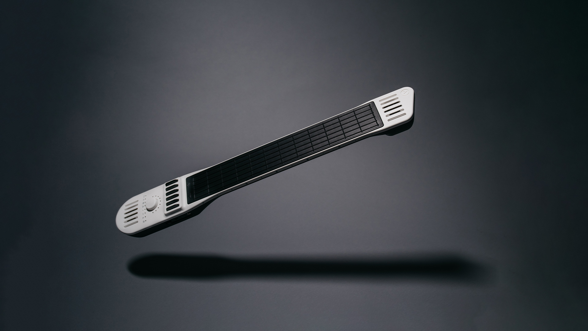

Even though the publicity and marketing surrounding INSTRUMENT 1 garnered the company a lot of attention, the truth was slightly less glamorous. For starters, while the product was sleek and futuristic looking, it was also a little challenging to wrap your head around. Sure, we musicians might seem open minded and experimental, but the reality is many of us are stubborn, know what we like, and skeptical of new ideas that threaten to shift the paradigm too much. Especially if that new paradigm shift is as expensive as INSTRUMENT 1 was.
Secondly, the branding around Artiphon and INSTRUMENT 1 at the time was heavily inspired by a high-design and mid century modern aesthetic. Clean, sleek, and dare I say... High Brow? I remember the words "Art Gallery" being thrown around a lot, and the language used to describe the product was often dripping with Silicon Valley tech optimism. The result was and instrument the came across as having been built to be admired rather than played, and that disconnect with the every-day musician showed in the revenue numbers.
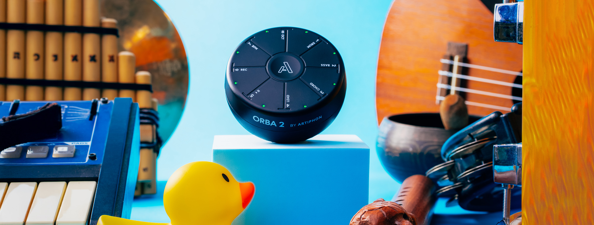
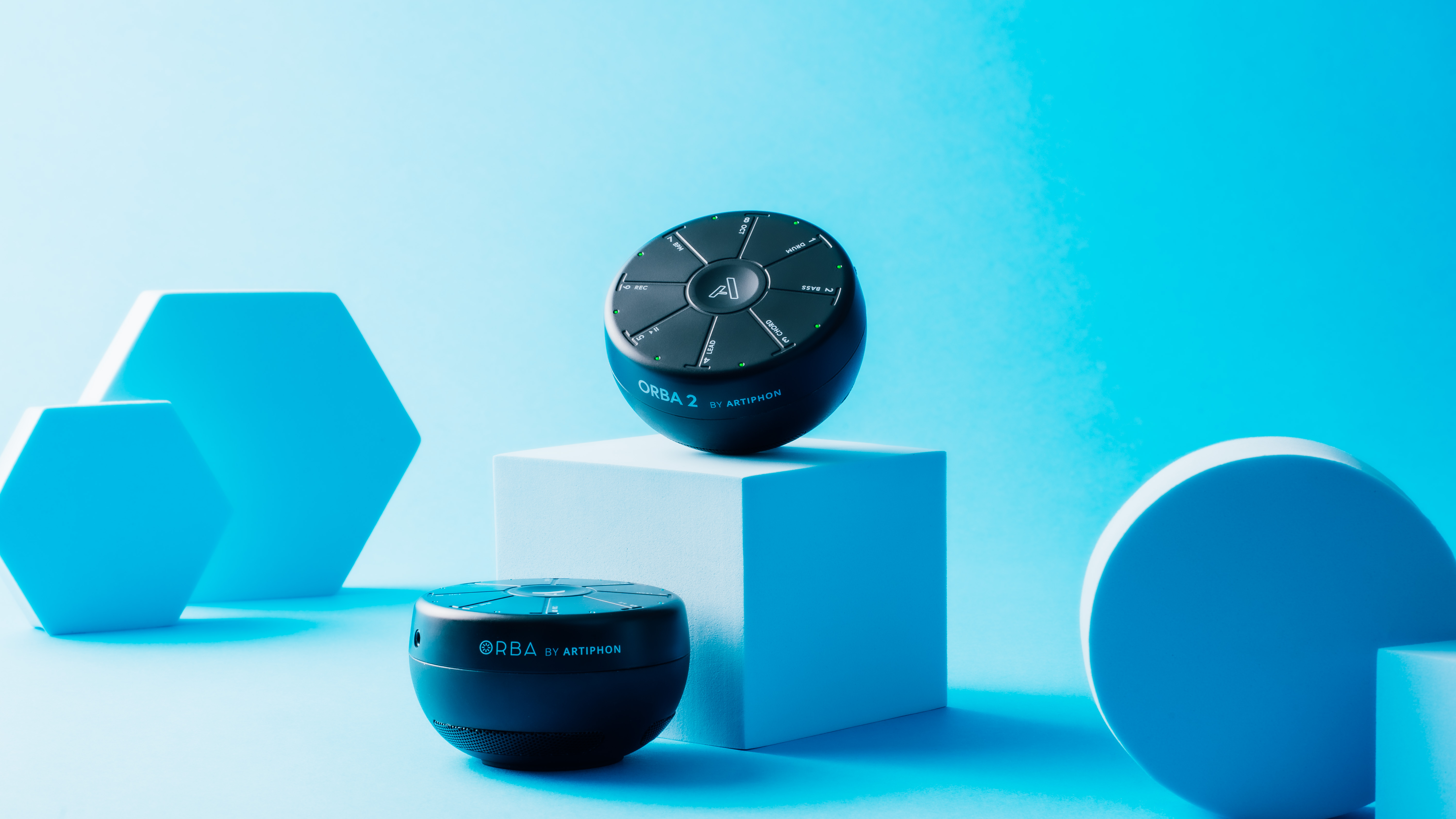
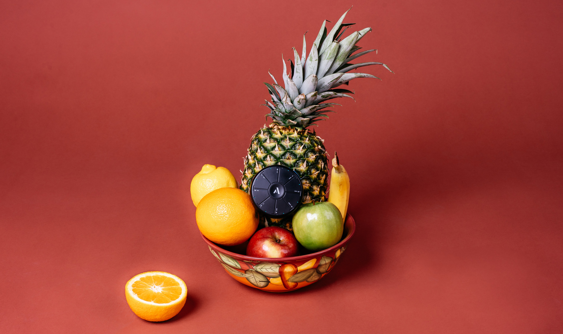
However, in 2019 with a whole new product launch on the horizon, we saw an opportunity to bring the brand down to earth and inject a little color and vibrance into it, in an effort to make it more accessible and bridge the gap between the high minded, futuristic ideals of Artiphon's products and the creative reality that music creators live in.
Ahead of 2019's new product launch we came to a simple conclusion: The brand needed to lighten up. The act of making music is supposed to be fun, creative, and light hearted, and the brand needed to instill those feelings in its customers. With a lower price point and an on-the-go handheld nature, this new product was the perfect opportunity to change the tone. So we got to work, using the upcoming Kickstarter campaign as a litmus test for our theory. We could keep an element of the "art gallery" feel, but instead of stark white backgrounds we would use bright colors. We replaced the staged stock-photo-esque scenarios with scenes that felt more real and lived-in, we updated the language to reflect a more conversational, colloquial style, and we injected the brand with fun, excitement, surrealism, and humor.
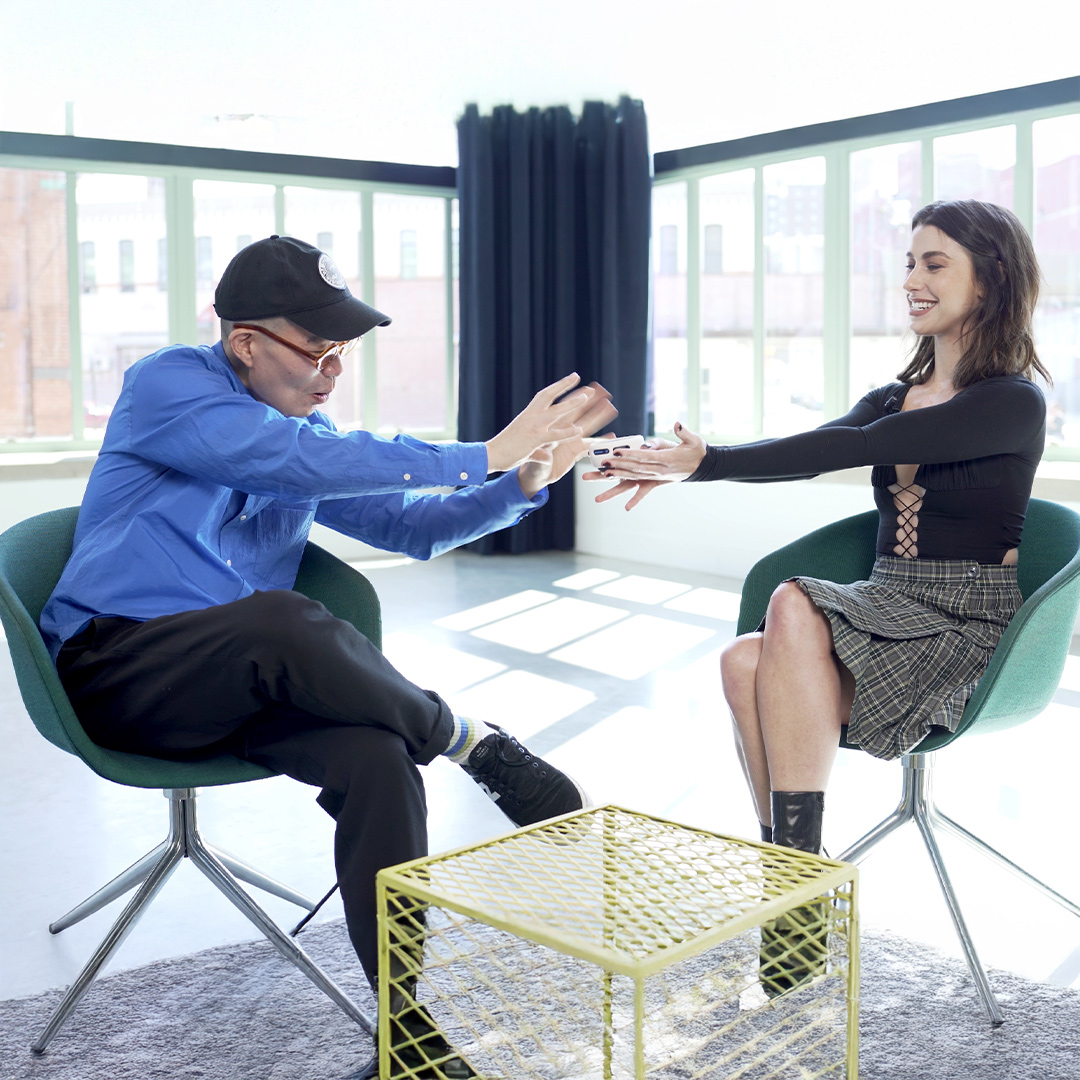
We also invested in value-based content and started to build a world where anyone who encountered us would receive value, regardless of whether or not they ever bought an Artiphon product. This content had to satisfy one of three pillars: It had to either Educate, Entertain, or Encourage the viewer, and often ended up satisfying a combination of the two. We called this content "Edutainment," and it was instrumental not only in reaching and connecting with new audiences, but in helping our existing audience wrap their heads around the company's unorthodox products and approach.
.00_01_23_08.Still004.jpg)
Not only as a Kickstarter campaign but as a product. Over the following 4 years the company: